Sunday, December 23, 2012

Sourcing - Color Of The Year by PANTONE® is Emerald !


PANTONE® , the company behind the standardized color reproduction system,
has announced that the 2013 color of the Year will be Emerald!


Emerald is a rich and radiant green, and most often associated with brilliant, precious gemstones.
The perception of Emerald is sophisticated and luxurious. Since antiquity, this luminous, magnificent hue has been the color of beauty and new life in many cultures and religions. Also the color of growth, renewal and prosperity, no other color conveys regeneration more than green. For centuries, many countries have chosen green to represent healing and unity.

Translated Emerald into our interiors;
As seen in our second INSPIRATION BOOK, we used already a lot of emerald green in our "Pagan Poetry" styling mood. The fresh green re-energize our homes and bring the positive spirit of spring into our interiors.
We go for a sense of well-being by using the emerald on accent walls, or ad a splash of happiness by using accessories in this jewel-like hue of green.
Well dosed and balanced, emerald tones can luxury-up your interior !

More info on PANTONE® here : http://www.pantone.com/pages/pantone/index.aspx

Wednesday, December 19, 2012

Sourcing - Architectural Trends for 2013 - Part II


In our last post this year, we look forward on upcoming trends
and evolutions in the world of architecture.
This ever changing builders stream is undergoing a true metamorphosis
now mesh is finally finding its way into prefab design.
New designers are introduced, new strong lines are set,
and finally color will find its way into our homes.
Our virtual future home looks fresh and streamlined, low on land impact,
designed with perfect details and gorgeous textures.
 

Deconstruction meets organic, natural look in minimalistic form.
Mesh installation by Botha ( Marketplace only )


Shadows and angles create tension.
Mesh installation by Botha ( Marketplace only )


Straight forward industrial look is offset with transparency of the glass panels.
Mesh build by Lithium


Stark lines suggest strength.
Mesh build by Lithium

 
 Strong architectural look in natural materials make a striking combination.
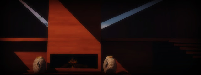
Mesh treehouse loft by Botha ( Tree Incl. ) ( Marketplace only )


Unexpected incisions of windows create an surreal atmosphere.
Mesh treehouse loft by Botha ( Tree Incl. ) ( Marketplace only )
The two big vases, next to the fireplace are designed by Eliza Wierwight for PATRON


Downscaled living, focused on living with respect for the environment.
Mesh prefab cabin by Fanatik
Big thanks to Irie Campese for letting us use her amazing SoManyStyles sim !

 
Main elements are concrete, glass and just enough wood to connect with nature.
Mesh prefab cabin by Fanatik

Sourcing - Architectural Trends for 2013 - Part I

In our last post this year, we look forward on upcoming trends
and evolutions in the world of architecture.
This ever changing builders stream is undergoing a true metamorphosis
now mesh is finally finding its way into prefab design.
New designers are introduced, new strong lines are set,
and finally color will find its way into our homes.
Our virtual future home looks fresh and streamlined, low on land impact,
designed with perfect details and gorgeous textures.


 Depth of space is magnified by the absence of doors.
Mesh skybox by Apple Fall.
Photography by Piedra Lubitsch.
 
 
Solid structures feel weightless in crisp white.
Mesh skybox by Apple Fall.
Photography by Piedra Lubitsch.


The introduction of neon colors in architecture makes us dream of a better future.
Mesh build by Breno
( We used the same build 4 times on top of each-other )

 
Downscaling trend, compact living.
Smaller homes create opportunities for landscaping architecture.
Mesh build by Breno

 
We feel a need to preserve our heritage, 
introducing authentic elements make our home a style archive.
Skybox prefab by POST
Photography by Piedra Lubitsch.
 
Using one style of doors, create a flow in your space.
Skybox prefab by POST
Photography by Piedra Lubitsch.


Connect with the sky and enlarge your spaces with glass ceilings.
Prefab by Nordari
Photography by Piedra Lubitsch.


Shadow play..
Prefab by Nordari
Photography by Piedra Lubitsch.

Thursday, December 13, 2012

Lifestyle - 2013 And Beyond..

Lifestyle - 2013 And Beyond..
Concept by Pitsch Parx
Photography by Del May, Rocketta Heaven, Marcopol Oh and Piedra Lubitsch.
 
 
Recent photography and art books have all featured the hidden face.
Heads turned just out of full view of the lens; long hair partially hiding facial features;
looking down, but never looking direct at the camera.
Is this symbolic of a new age of prudery?
Or is timidity the new zeitgeist? The truth is that there’s a lot more going on that meets the eye.
History teaches us that evolution comes in waves and every action has a reaction…


In a virtual environment, it seems ironic we should hide our avatar faces.
We are already shielded by our virtual selves and even when wearing a mask,
our avatar names are displayed boldly above our heads.
 
 
The rapid acceleration of social media now means we are living a more exposed life:
our digital footprints are prolific.

We have seen it all. Information and image overload.
We create a version of our selves how we want to be seen
and virtual worlds are a perfect example of this.

Social media plays the same role.
We all wear ‘masks’ to show the world a better more upgraded version of ourselves:
a real version of the virtual us? Or a virtual version of our real self?
 
 
But, we are human and it’s in our nature to think.

And at some point, we look back…back to a time when everything was peaceful and easy.
A time when we didn’t have to hide – but those days are gone.

Driven by nostalgia and an inner urge for quiet, we wear masks, we cover our faces,
we look down, we look up and we look away…
 
 
There will be a backlash.
In the future, we will cherish anonymity and a new romantic mood will become apparent…


Getting back in touch with nature
and our own bodies will inspire a palette of grey, flesh tones and subtle shades.
Fashion accessories such as wrap around head scarves and oversized capes and coats
cocoon us from the outside world.
Invisibility is our new ally.
 
 
In interior design, we turn our backs on large rooms and retreat into smaller spaces:
building walls physically and metaphorically.

Windows will become rounder: our portholes onto the outside world.
Beds are womblike with canopies and architecture will return to organic shapes and forms.

Wing backed chairs provide instant private space and seating will be designed to create intimacy.

It is time to retreat…
 
 
More info and work from our artists in this post can be found here;


Sunday, December 9, 2012

Sourcing - Into 2013..


Here at Inspiration Book, we like to spot the latest trends and talents in any life, so when we first came across the work of ShaySibrian, we just had to include her in this issue.
Not only was Shay the first in SL with a full mesh sim; she also has a great eye for concepts and interior design.
Inspiration Book used her ‘Celoe’ store to highlight our key guide for 2013 trends.


Blank canvas meets white wall: let light and shadows weave their magic….
Layer up and create the tranquil ambience often found in Asian landscape art. Ethereal, transient and easy on the eye.


Rethink maximal: choose minimal objects, don’t obscure your camera frame.
Allow rooms and walkways space and flow for pleasurable retail therapy. 


Play with fresh shapes and innovative solutions.
We loved the cut out elements in these walls.
Like vintage lace revealing the lining of a dress…


Classic design is timeless, but that doesn’t mean boring.
The new classics are fun, glossy and childlike. Let 2013 be all about the lighter side of life!


Honest design: forget hidden surprises and over the top packaging, showcase your product as it is.
 
 
Details rock!
Every detail of your store, your designs and products reflect the real you.
Unleash your hidden imagination and show the world how you want to be seen.


Colour will be central in 2013.
Bright and bold, abstract and graphic, neon and neutral – there’s no escaping its rainbow influence.

 
Spirituality and our core beliefs will be reflected in our interiors.
Inventive light and shadow play illustrates this zeitgeist


Graphics and artistic elements abound.
This amazing skyline painted on the ceiling looks like it came from an ancient religious building.


Stop customers in their tracks. Delight and amaze!
Window dressing in virtual spaces is just as sexy as in real life.
Be abstract and use clever composition of products to prove that less is more…

Tuesday, December 4, 2012

Crystall Christmas by Neva Crystall

Mood Nr 1 - Winter Neon
Crystall Christmas
Styling & Photography by Neva Crystall
 

Our set is build up in a Scarlet Creative design.
From PILOT we used the big birdcages and a decorative tree.
Twigs in a big bowl and a winter wool fluffy rug from LeeZu, the pinecorn decor comes from WhatNext.
Hanging twinkling stars found at LISP.


Staning clock, decorative fairy lanterns and tiny dummy, all found at ArtDummy.
From Y'sHouse, vintage round chairs and white shelf.


From TheLoft, we used the big decorative branches, the modern dining table, antler candles and the candles in glass.
Letters bookshelf, crispy white daybed, Barcelone-inspired chair and stool, all from Abiss.


Dinner set from FollowUs.
The napkin pile, books, fork pile and grouped glasses, all found at ARIA.
Champagne set is a full perm prefab from Meli Imako.


Thursday, November 29, 2012

Deck The Halls by Pitsch Parx

 Mood Nr 1 - Winter Neon
Deck The Halls
Styling & Photography by Pitsch Parx
 

This decor was build by the Inspiration Book team, and therefor not for sale as a build.
However, we used prefab mesh windows from Estatica ( sold as full perm building components )
Bricks & floor textures used on the build are both from Distressed.

Outside; Snowy pines from Heart and Winter Birch from *aG*
Big white Christmas tree by New Trails, potted in a mesh planter from Trompe Loeil.


Gorgeous victorian chandeliers designed by CIRCA.
The string lights can be found at WhatNext.


Out setting is build around amazing driftwood and glass tables from DIGS, all the playful stools are designed by ArtDummy ( we modified the color )


Neon pink place settings from L'aize Days ( modified the color ) mixed with piled plates from NorthWest.
Grouped wine glasses from ARIA and the tray with glasses from PoPart.
The decorative big metal bowls are from POST.
Fruit bowl and big candles covered with ivy, both from UrbanizeD.